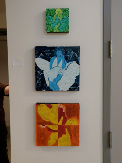
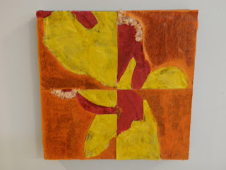
So for my color project piece I chose Marylin Monroe because I like her and her classy-ness that she gives off. For the dots part I went with the color green because green in my favorite color. When I was doing the torn paper I went with the color blue and I thought well hey why not make her look kind of grungy instead of classy. For the tracy paper phase I saw Kathy messing with my pictures of Marylin and making them abstract and I thought well why not go with the abstract? With the I think that my critique for my color project went well I thought that my strongest piece was the torn paper piece and that I wasnt exactly sure which other piece were the weakest. Everyone agreed that the strongest was the torn paper because the grungy painted effect in the background compared to the strips of paper used for her dress.


No comments:
Post a Comment